Top 5 Web Design Tips For 2016
Focus on your main goal
Focus on your main call to action and main elements. What are your goals for this website? Do you want people to call you or click and order something. Focus on that element. Content is needed (Food For Google) and I still believe good quality content is king, but burying or overshadowing your key elements with secondary elements may distract visitors from actually contacting you. A website visitor that you never hear from or benefit from is worthless to you.
Get rid of all unnecessary content
This is hard for a lot of people (even me). For years we have been taught that content is king and many people say the more content you have the better chances you have of out ranking your competition. Well times change and so do people and search engines. People want quick content, short-form content is better than long-form content in today’s “get it fast, and get it now” attitude. Attention spans are shorter than ever so trim the fat and shorten up your content.
Reduce the number of pages
Reduce the number of pages you have to the min. you really need to supply your visitor with what they need. If you want to add a lot of information and pages to your site, consider using a secondary sub domain or section with wordpress/blog to build up content. Too many page choices may take away your chances of a visitor hitting on the pages that really matter, like your order now or lead page. Your “money page” should not be buried among to many choices.
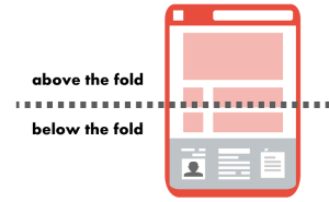
Get more content above the fold
Studies show that visitors spend most of their time above the fold on most websites. Cram your key points, links, and content above the fold and less important search engine food below the fold. Your call to action should always be above the fold (top portion of your pages).
Limit your website color
Using too many color on your website can make your page seem cluttered and be a pain on the eyes. To simplify your website, Limit your color scheme to 2-3 colors.


